Visual direction → Brand Identity → Web Experience
Brand Designer > Art Director > Web Designer > Photographer

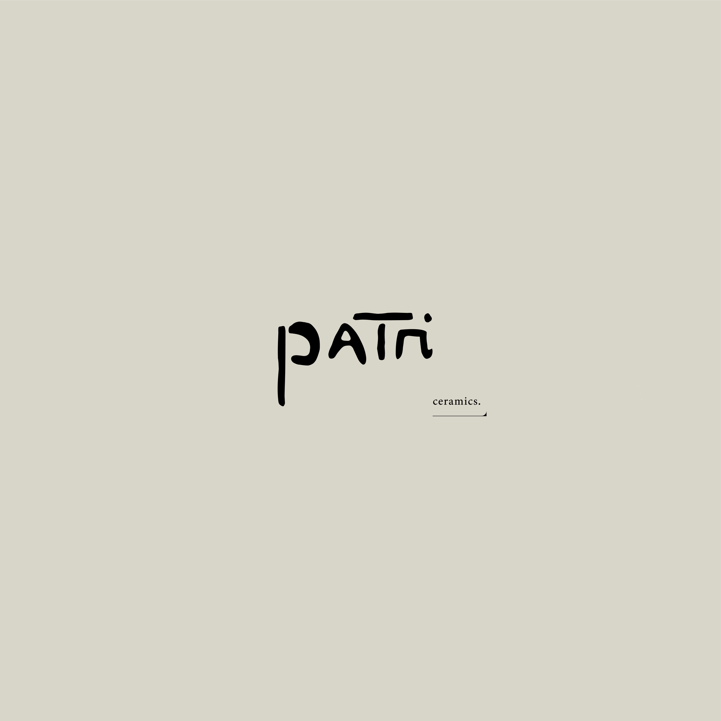
Patri Ceramics
Dusted Porcelain, #F8F6F1
[ brand design ]
Brand Designer > Art Director > Web Designer > Photographer
Concept
it started with an interview…
ceramics as play, ceramics as family, ceramics as a way of moving through the world with curiosity. Because Patricia Hardiman still considers herself an amateur and has no intention of selling her work, the digital presence needed to reflect that spirit. The concept centered on creating a space for exploration rather than commerce, a quiet archive that mirrors the tenderness and experimentation of her studio practice.
DELIVERABLES
Art Direction
Brand Identity
Graphic Design
Product Photography
Website Design
Design
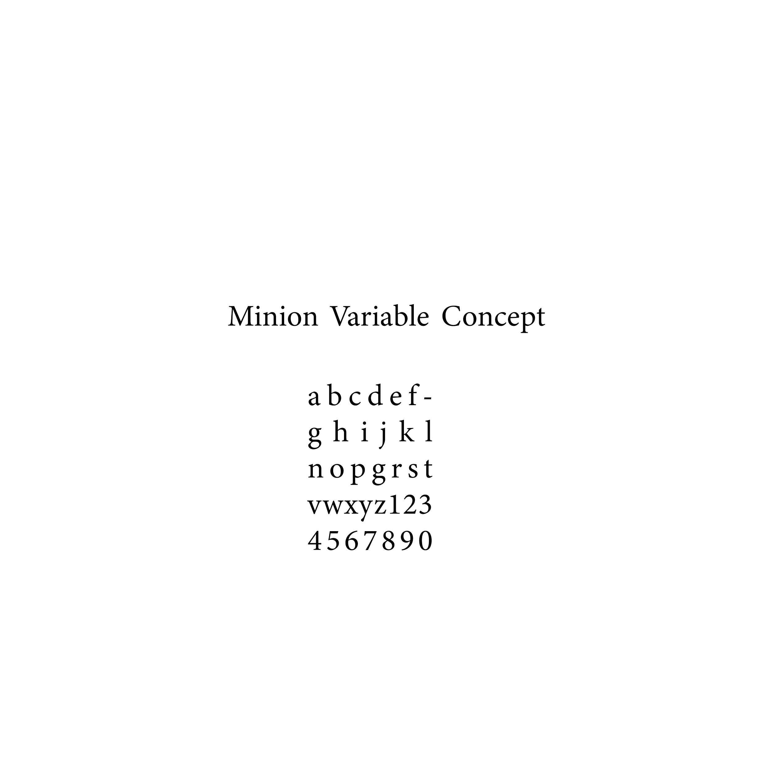
The design translated the conceptual framework into a visual identity rooted in material play. The logo takes its cues from unstructured clay bodies—forms that are still in motion, still becoming—giving the mark a sense of softness and quiet irregularity. Around it, a visual language emerged: color fields in transit, gentle typography, and a system that prioritizes material sensitivity over rigid structure. The identity system was built to feel lived‑in and flexible, echoing the evolving nature of her craft.
Dusted Porcelain, #F8F6F1